
I opted to work on a BG Canvas. These are made by a local South African artist, Betzy Geldenhuys. Every canvas is fused to a masonite board which is then mounted on a frame. The frame is painted pitch black and the canvas is treated with gesso. This means that you have the best of all worlds; your canvas won't bend and buckle, the surface will still meet Gallery criteria and you have a neatly finished deep frame that won't cost you extra for framing. Brilliant product! I draw my sketch very roughly with charcoal on the surface.


I then gather all the necessary materials that I might need. I prefer to work on a tear-off palette. When you are done you can simply tear off the top sheet and you have another clean sheet ready for use. I clamp the palette down, because the pages do tend to work themselves loose and curl up. If you don't like this there are a variety of wooden and plastic palettes available for consideration as well.

I will also need my oil colours, brushes and palette knives.

Finally, I also need a little bit of oil on the side. Some artists prefer to work with turpentine, but I find the smell too strong and prefer to use artist's oil. You can also use Liquin or Zelkin or Dala's Oil Painting Medium. The last three will assist in speeding up the drying process of the paints. Using oil or turpentine in the painting will actually slow down the drying time.

I use a rather wide flat brush, a no. 8 or 10. I squirt a little Ceruleum Blue and Titanium White onto my canvas. I dip my brush in the oil and then pick up a little blue paint with the same brush. Dipping the brush in oil first will result in the oil gliding onto the canvas more smoothly. This makes it easy to paint smooth surfaces that does not have clear brush strokes. If you find it too difficult to maneuver the big brush into the smaller spaces, I recommend you use a no. 4 flat when necessary.

Cover the air with the blue. When you are done, dip your brush in the oil and the Titanium White. Blend lighter shades into the air so that the air will not be a solid blue, but will have subtle hues. Concentrate on making the horizon especially light. It is always lightest on the horizon where the light from the sun reflects off the earth. (I kept the charcoal lines quite pronounced throughout the painting for instructional purposes, but normally I will wipe the excess charcoal away with a clean dry brush. I will even use an eraser to rub out stubborn dark patches. The charcoal will leave enough of an outline for you to be able to paint, using this as your guide).


I use the same brush for each band. Simply squeeze the excess paint out on a tissue paper between colours and 'wash' your brush in the oil. The brush will come out sufficiently clean enough to continue painting.

The last bands of flower fields are painted exactly as above. I use Cadmium Light Red and Cadmium Orange respectively for the remaining bands.


I am now going to paint the pathway. I use a palette knife to mix Raw Sienna and Vandyke Brown.


Looking at the picture I decide that I don't like the cyclist or the pathway. I choose Prussian blue and mix it with the browns from before to create a more interesting pathway. I cover the cyclist completely. I will add him again during the last steps. This darker pathway makes a much better unity with the blue from my sky at the top of the painting.


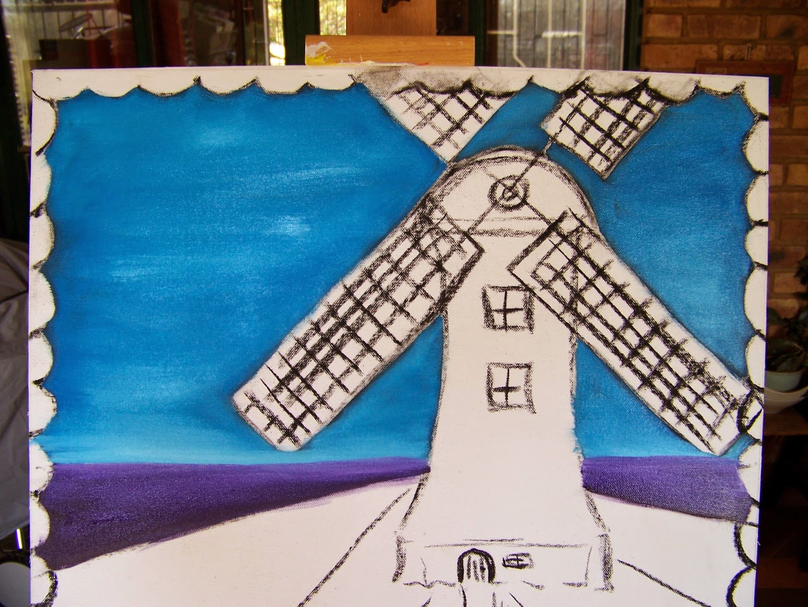
I paint the windmill with Titanium white. I then dip my brush in the Permanent Violet to create the darker shades at the side of the mill that will create the impression of a rounded shape. When I am done I simply touch the outer edge every now and then very lightly with Vandyke Brown to create sporadic deeper shades.


I now flip my brush over to draw lines in the wet paint of the blades/fans and the door. This is called scgraffitto. I touch red, purple and blue inside the windows. This will create the impression of colours and objects hidden behind the glass.

For more
crafty ideas and great products, visit APrettyTalent.com.
Remember to
keep nurturing your TALENT for making PRETTY things.
You can
subscribe to this blog and receive regular updates by email by simply
registering your email address at the top of the current blog.
No comments:
Post a Comment